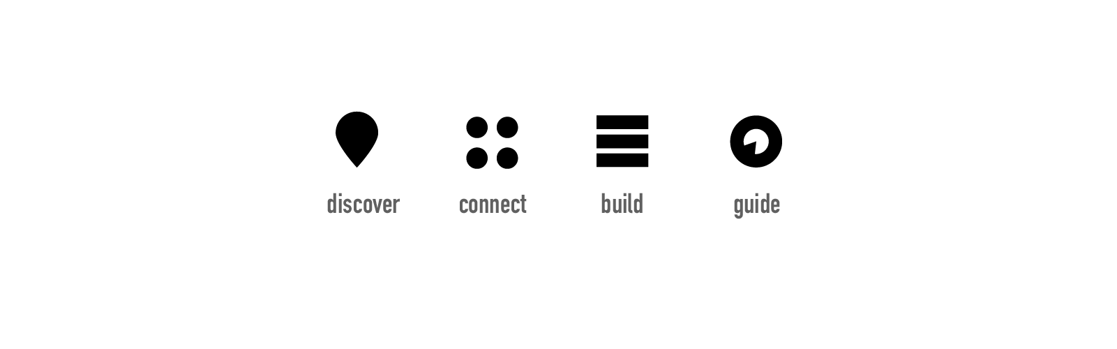
Over the years we’ve had the opportunity to partner with Bloom Works on a number of different projects. We were delighted when they reached out to ask about creating a brand for them and their expanding business. We wanted to make something functional that also helped tell their story. We landed on using multiple symbols to create one amalgamated logo displaying their multiple areas of expertise.
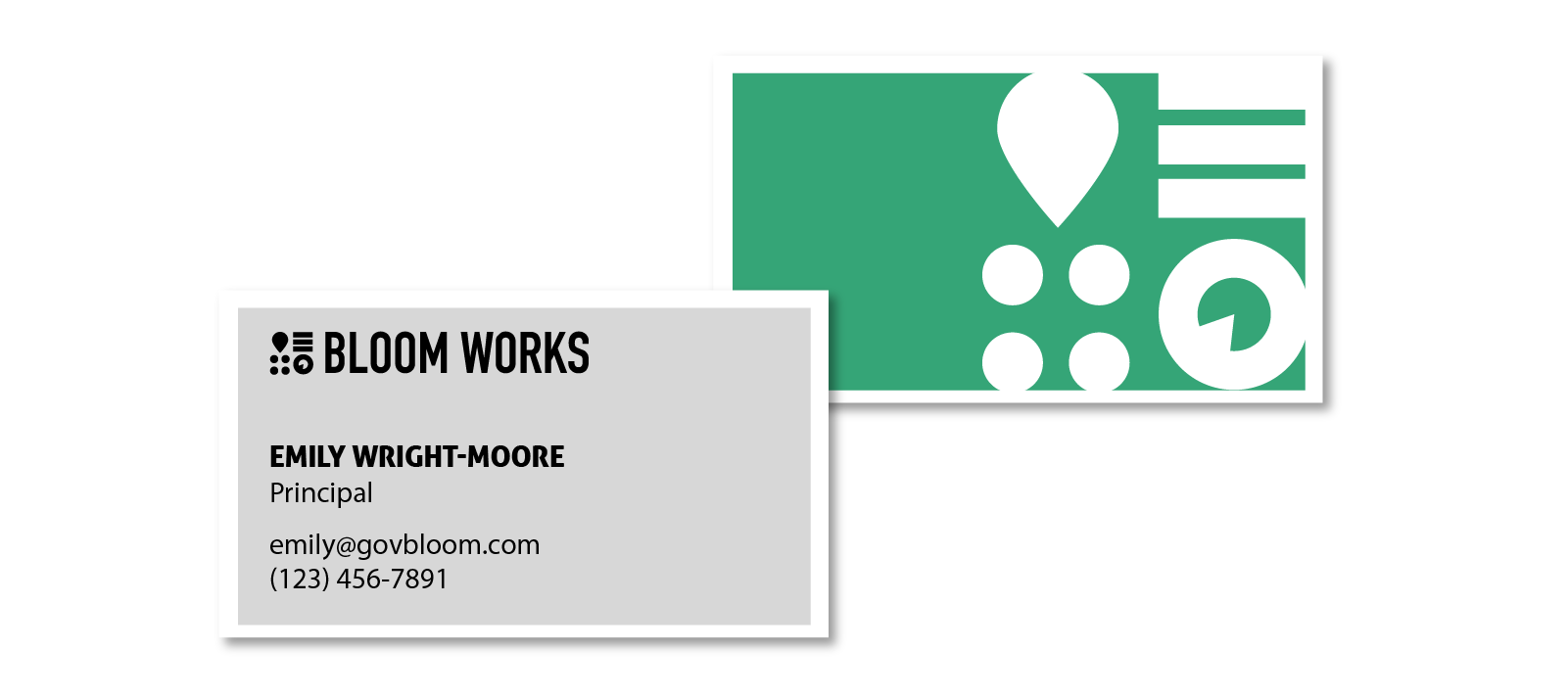
Strong contrast was a cornerstone of what the client wanted and that’s what we were here to provide. Initially opting for a black and white color palette the clients eventually moved towards keeping at least one pop of color from their previous brand. The green that was carried over was seen as a way to tie the old brand with the new.


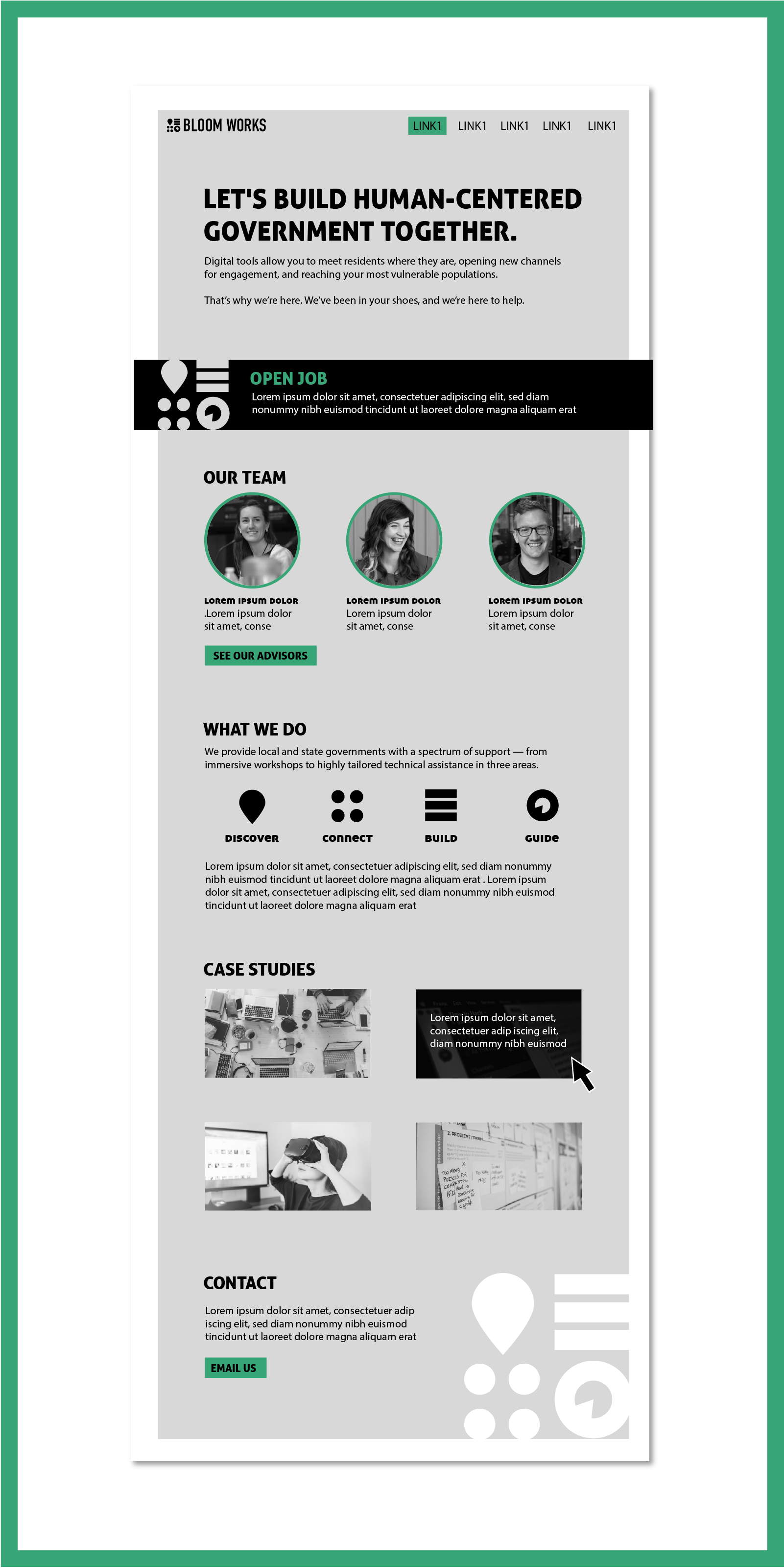
As an add on they ask for a mock up of what their homepage could potentially look like. We often have clients ask us to do an initial mock of a new website to get a sense of what the possibilities are.